prototyping & workshops
Taking the feedback from our tutors and classmates, Ana and I started to think about the form our project would take. We had reached a stage where making choices and decisions was imperative. Having gathered the data and representing it, from our previous workshop having 2 participants, we decided to first iterate on how we could create a medium for a larger group of people to represent their temporal changes. Our second challenge was finding more participants that would be willing to participate in the workshops. Making changes to the structure and plan of our workshop so it is not be as demanding of the participants’ time as the previous one, was an important change we accounted for as well.
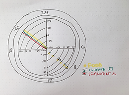
We started thinking of ways we could create a tool that could allow people to map their temporal changes. The previous prototype had a linear structure allowing for only a certain number of categories and the scale of priorities was not clearly visible. We got inspired by the circular shape of a clock and decided to use that as base. In terms of temporal changes we decided for the prototype to focus on just three being food, climate and travel; as these were the most common from our gathered data.


Sketches that represent the modifications to the prototype
One of our approaches was having more than two hands on the clock, representing different tempos. Our previous prototype accounted for nature time showing a distinction between the two cities. However, we felt that would be quite a lot of data to fit in for a large group of people and decided to focus on the nature time of London. We researched radial graphs for inspiration for ways we could incorporate our matrix of priorities. The last stage was exploring the digital and physical elements our experience could have. We wanted the map to be physical with the ability to showcase the mapping of these temporal rhythms digitally, allowing for browsing through different participants' rhythms.


The prototype with its digital and physical elements
The reiterated prototype with its physical and digital elements, shows the 24 hours in a day, three coloured strings representing the three tempos being food, climate and transport and a radial graph ranging from -100 to +100, for participants to map their changes in rhythms. This was supported by a digital element, allowing people to toggle between tempo categories, and see the difference of temporal rhythms between participants.
WORKSHOP - ROUND 2
Our next stage was the second round of workshops, for which we created a new plan and structure. Reflecting on our previous workshop, we wanted to use Sanders and Stappers' participatory and co-designed approach and be able to get a good number of participants. The flow of our workshop was as follows:
-
A brief introduction to our topic
-
Give personal examples in order for participants to be able to understand and resonate
-
Ask participants to think about their changing paces of life and write down their experiences, or examples
-
Choose any one of the changing tempos and create a visual representation of it
-
End the workshop with a discussion of what they have created
For this workshop, we got 9 participants who were students from UX and Service Design at LCC.
WORKSHOP FINDINGS
On analyzing our participants' outcomes, we were able to see a new set of tempos that emerged and went beyond just food, climate, and transport. Changes in prices, nap culture, personal growth and freedom, and work culture were some of the categories. Having heard each participant's stories and how personal and subjective they were, we started thinking if our circular prototype was the ideal way of representing the qualitative data.
Below are the outcomes of the workshops.


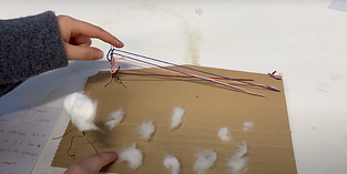


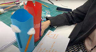


Visual represetations of the changing paces of life - outcomes of our participants
We were able to improve on our workshop structure and engage more participation. However, our original idea of using our improved mapping prototype to represent the data from the workshop did not follow through. Focusing on 3 tempos and measuring them on a scale of priorities and feelings was moving away from our research question and therefore we decided to remove that from our design process. Each story had its own set of rhythms, and layers and combining that in a universal visual was flattening the complexities of tempos. Ideating on what would be the right way to represent these stories was our next step.